Okay, so I know that when you read or click on a headline like this, you don’t want any backstory to the idea that led to the increase—you just want the details. You want the information, not the inspiration.
I get it. So I’ll include the why to the how at the end of this post for those interested.
Here are the two things I did that increased the number of new followers on my Instagram from 85 to 392—a 361% increase—in just one week:
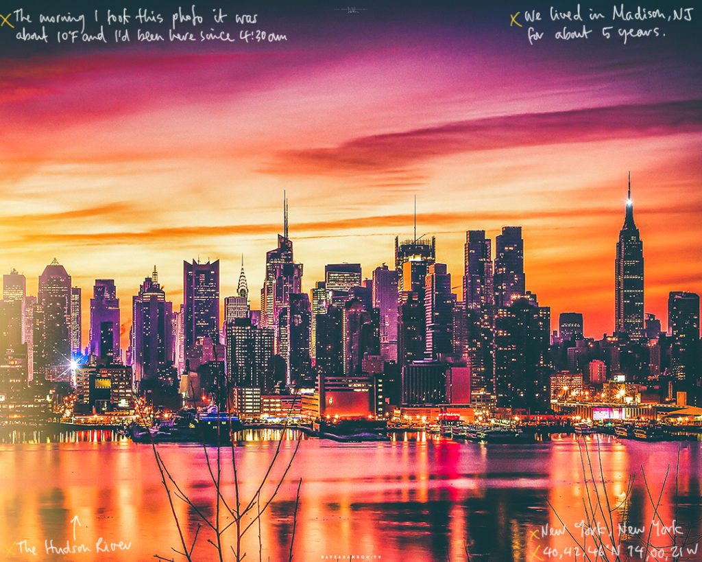
1. I annotated my photos.
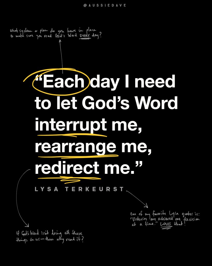
2. I added one daily graphic post to my feed.
That’s the Cliff note version on what I did. Here’s the explanation of how I did it and why it worked.
1. Annotating photos
I’m a photographer and pride myself on posting only high quality images to my Instagram account—which means I take time to process, color, crop and export my images specifically for the platform. And while my account has grown as a result and I get good engagement, Instagram’s algorithm doesn’t reward sharp, well composed photos—it rewards interaction, time spent on posts, and people zooming in.
With this in mind, I started writing small notes on my images that provide information about the photo, and the post. I did this simply on an iPad Pro using an Apple Pencil. The result was, people were enticed to zoom in to see what I’d written, which meant they also spent more time on the post.

In one week, the extra attention saw my posts rank higher in Search and Explore, and hashtag searches, which directly led to the high level of growth in new followers.
IMPORTANT NOTE: I go to great lengths to make sure the annotations are insightful, helpful, and relevant. Otherwise, people will stop taking the time to read them.
2. One extra graphic post every day
I always post my photos in the morning on the east coast of the US, and always include a long-form caption. So, to mix things up, I added a graphic post in the evenings that is simply a quote or idea from the morning’s post. This post is easier for people to read quickly, so typically gets more likes than the morning’s post—so the added engagement increase the overall ranking of my channel.
And yes, I annotate this graphics too.

So that’s the information, heres’ the inspiration.
Toward the end of last year, I was bored with my Instagram feed. I have more than 36,000 followers who I care for and engage with regularly, but I needed some new inspiration to continue in 2019. So in early December I reached out to my friend Ryan Maher who runs the @BibleLockScreens Instagram account. We brainstormed some ideas, and he suggested the extra graphic post.
The same day, I was scanning some posts from the incredible photographers I follow, and noticed Garrett King was annotating images from a trip he took to Antartica. I found myself zooming in to read his simple, handwritten notes, and was hooked.
Writing the notes on my photos has added an extra element to the teaching I do in my posts, and allowed me to give some insights into how, where and when I took the photo.
So that’s it!
What do you think? Is this something you would try? If you decide to give it a go, let me now how it goes.

Thanks Dave your generosity in sharing this info is so helpful
I hope it helps … even though there’s a risk it will now be over-used and won’t work anymore.
Thanks for the insight Dave. Which app do you use for annotations?
I use the Photo app on my iPad. No extra apps required—just use the mark up feature.
Nice! I love that you keep it simple!
I don’t have time for complicated 😉
I understand your reasoning but for me personally, it makes the pictures and the quotes look cluttered. I would rather have all these comments in the body of your post. But that is just me and I certainly won’t stop reading and learning from your posts.
I appreciate your feedback Carolyn! Not everyone takes the time to read the captions like you do, so if the annotations (which I know are not for everyone) means people get a little more info as they scroll by, then I think it’s worth it. I’ll experiment with less annotations so they are not as cluttered.
Thank you for sharing this insight! I may just give it a try.
Let me know how it goes.
All social media engagement benefits aside, I really like the personal touch the annotations bring to your posts. We are so used to digitally created resources, and handwritten fonts, it is much more rare than it used to be to read something actually written by someone else. This is especially true since we send and receive so much email and messages instead of snail mail and postcards. Thanks for helping us see a creative way to bring the personal touch back to social media and our digital world.
Thanks Mike. I could not agree more! I could have found a “handwritten” font to use—it would be a LOT easier—but decided against it. I wanted it to be more personal.
I have to admit, I wondered why you made the text so small! But I love your images so I did indeed zoom in to read. Very nice. I like the idea to post twice about the same idea, but with a different design. Thanks for the inspiration!
I hope they add a touch of the personal to my social posts.